Say what you will about Baz Luhrmann. Call him excessive. Call him flamboyant. But the man knows how to make a story feel alive in ways most directors wouldn’t even attempt. His 2013 adaptation of F. Scott Fitzgerald’s The Great Gatsby is proof of that. It split critics right down the middle, sure. Some called it hollow spectacle. Others recognized something more deliberate happening beneath all that glitter. Over a decade later, the film’s visual approach still sparks conversation, and honestly, it deserves a closer look.
A Director Who Doesn’t Whisper
Luhrmann has never been interested in subtlety, and that’s kind of the point. Think about ”Moulin Rouge!” or ”Romeo + Juliet”. His filmography screams with colour, movement, and sensory overload. With The Great Gatsby, he brought that same philosophy to Jazz Age New York and cranked up every visual dial he could find.
Cinematographer Simon Duggan shot the film on RED Epic cameras paired with Zeiss Ultra Prime lenses, a combination that delivered razor-sharp images and rich colour reproduction. The camera rarely sat still during the first half of the film. Dollys, pans, crane shots. Everything was in motion, building a dizzying sense of energy that matched the chaos of Gatsby’s legendary parties.
Colour as Storytelling
One of the more clever things Baz Luhrmann did was use colour as an emotional compass. Scenes involving Gatsby are drenched in warm, almost lurid tones. Golds, greens, soft pinks. Everything feels saturated with hope and longing. Compare that with the framing narrative, where Nick Carraway recounts events from a psychiatric facility. Those scenes are deliberately muted, washed out. The contrast tells you everything about Gatsby’s impact on the people around him without a single line of dialogue needing to do that work.
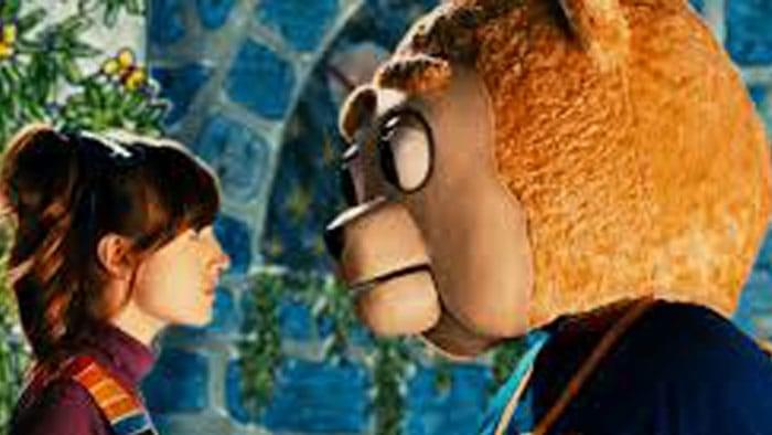
That gilded green-and-gold palette has proven remarkably sticky in the decade since the film’s release. Art Deco revivals show up everywhere from fashion editorials to themed restaurants, and the entertainment industry has leaned in too. Relax Gaming’s Great Pigsby casino slot is one of the more playful examples, a cheeky reimagining of Fitzgerald’s story with Jay Pigsby himself hosting a mansion soirée. The Art Deco styling, the champagne-soaked atmosphere, the roaring twenties soundtrack. It all leans on the same visual shorthand Luhrmann helped cement.
Production Design That Earned Its Oscars
Let’s not overlook the physical spaces. Catherine Martin, Luhrmann’s longtime collaborator and wife, designed costumes and sets that pulled from the full span of 1920s aesthetics. Luhrmann gave her a specific rule: anything from 1922 to 1929 was fair game, since the novel was set in ’22, published in ’25, and essentially foreshadowed the crash of ’29. That flexibility let the design team blend Art Deco opulence with period accuracy in ways that felt both authentic and heightened.
The tea scene between Gatsby and Daisy is a perfect example. Every surface is overwhelmed with flowers, from floor to ceiling. It’s almost absurd, but it mirrors Gatsby’s desperation perfectly. The film won two Academy Awards for costume design and production design, and those were well earned. Over 1,500 visual effects shots supported the physical sets, blending CGI environments with practical locations filmed at Fox Studios Australia.
Why the “Style Over Substance” Critique Misses the Point
Here’s the thing critics often got wrong. Calling the film “style over substance” ignores the fact that the style is the substance. Fitzgerald’s novel is fundamentally about surfaces, about the glittering façade hiding rot underneath. Luhrmann’s visual excess mirrors that theme deliberately. The parties are supposed to feel overwhelming. The wealth is supposed to look garish. When that visual richness slowly drains away in the film’s final act, as colours fade and the camera settles down, you feel the loss in your gut. That’s not accidental. That’s direction with intention.
It’s worth noting that this visual language has rippled outward beyond cinema. The film’s Art Deco aesthetic influenced fashion collaborations with Brooks Brothers and Tiffany & Co., along with jewellery collections that tried to bottle that roaring twenties look for a modern audience. It’s a testament to how strongly Luhrmann’s vision cemented the era’s look in popular culture.

Looking Back With Fresh Eyes
More than ten years on, Luhrmann’s Gatsby feels less like a divisive experiment and more like a filmmaker making exactly the movie the source material demanded. Fitzgerald wrote about excess, illusion, and the hollow centre of the American Dream. Luhrmann made you see it, hear it, and almost taste the champagne before pulling the rug out. Not every frame works perfectly. Some CGI shots feel heavy-handed by current standards. But the ambition is undeniable.
The film grossed over $353 million worldwide and remains Luhrmann’s biggest commercial hit. Fitzgerald’s granddaughter said Scott would have been proud. That might be the most telling review of all.