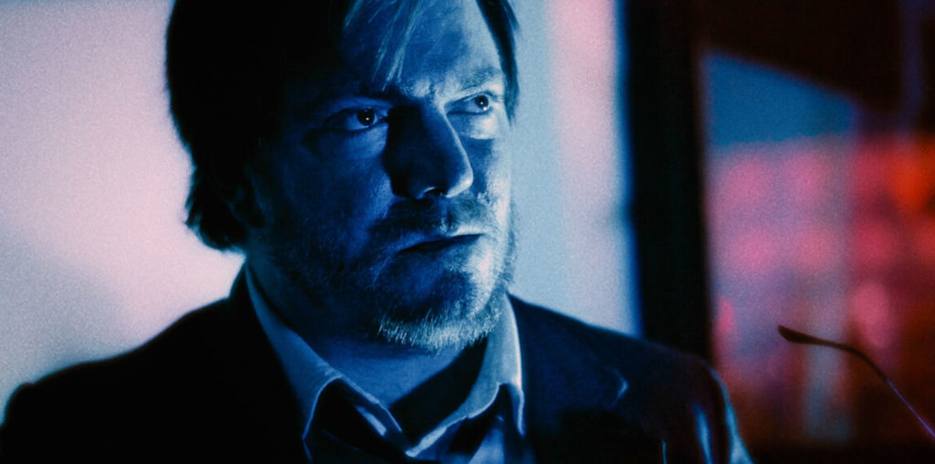
You can often tell a film’s genre before anyone says a word. A lonely streetlamp in the rain suggests noir. A corridor lit in cold blue hints at science fiction. A creaking door, a candle and an empty chair do rather a lot of work for horror.
That same visual shorthand travels remarkably well into interactive entertainment, including slot design. It isn’t simply about borrowing a few familiar props. Good visual design creates a setting, establishes a tone and gives viewers something to read at a glance. Whether the theme is gothic horror, space opera, high fantasy or a neon-lit retro fantasy, the strongest designs understand the grammar of cinema.
For adults who enjoy looking at how popular screen language shifts between formats, slots can be an interesting small-scale exercise in production design. The reels may be compact, but the references can be surprisingly rich.
Why film genres translate so neatly to interactive formats
Genre cinema relies on shared knowledge. We recognise a western from its dusty landscape, hats and saloon doors. We recognise a monster story from shadows, strange footprints and a sense that something is just out of sight. These cues save time, which matters in film and matters just as much in an interface where the first impression has to be immediate.
As the BBC’s overview of genre puts it, genres help us categorise media texts. They also guide expectation. A viewer knows, broadly, what kind of world they are entering and what emotional flavour the makers are aiming for.
Slots use that visual economy well. The format has limited screen space, so designers tend to favour symbols that can carry a lot of meaning:
- A cracked moon, wrought iron and a weathered manor for a gothic-inspired setting
- Helmets, lasers and chrome surfaces for science fiction
- Maps, keys and ancient temples for an adventure quest
- Velvet curtains, bright bulbs and geometric typefaces for retro glamour
It’s a form of visual shorthand, rather than a replacement for cinema’s slower storytelling. A feature-length film can spend two hours developing a world. A themed slot has moments to establish its identity. The task is closer to a film poster or an opening title sequence: make the atmosphere legible, then keep it coherent.
That’s why genre is so useful. It gives designers a ready-made vocabulary, while giving adult audiences a frame of reference. You don’t need a detailed backstory to understand that a dark castle suggests danger or that a starship bridge suggests exploration. The images have already done their cultural work.
Mise-en-scène matters, even on a small screen
Film critics often use the term mise-en-scène to describe what has been placed before the camera: sets, costumes, lighting, props and composition. The film-studies definition is useful here because it reminds us that a scene’s meaning is rarely produced by dialogue alone.
In slot design, there may be no camera in the conventional sense, but the principle remains. Every detail is a choice. Backgrounds, borders, typefaces, symbol shapes and colour all contribute to the feeling of a fictional place.
Colour sets the emotional temperature
Colour is usually the quickest route into genre.
Horror often leans on sickly greens, deep reds, charcoal blacks and candlelit gold. Sci-fi has long associations with metallic silvers, saturated blues and sharp electric accents. Fantasy may favour jewel tones, misty forests and warm firelight. Retro aesthetics can range from 1950s pastel optimism to the hard pinks and purples of later synth-inspired imagery.
None of these rules are fixed, of course. A clever designer can reverse them. A horror setting lit in clean white can feel more unsettling than one filled with darkness, precisely because it unsettles expectations.
Framing and icons tell us where we are
A reel layout is a frame. Its decorative edges can suggest an old theatre, a spaceship console, a medieval manuscript or an arcade cabinet. The symbols within it then act like recurring objects in a film set.
Consider the difference between a chipped stone key, a polished laser device and a gold compass. Each is a small object, but each makes a promise about the world beyond the screen.
Production design also benefits from restraint. When every corner glows, spins and flashes, it can become difficult to identify what the theme actually is. The better examples usually keep a clear hierarchy: background world first, major symbols second, ornamental detail last.
Sound, movement and the feeling of a scene changing
Visuals establish a setting, but sound and animation decide whether it feels alive.
Film scores use repetition to create recognition. A particular instrument, rhythm or short musical phrase can signal an approaching figure, a change in location or a shift in mood. Interactive entertainment applies the same idea through stings, ambient loops and responsive effects.
A horror-inspired design might use distant wind, low strings or the creak of timber. A space setting may use hums, pulses and synthetic tones. Retro designs might lean towards brass, lounge rhythms or analogue-style electronic sounds. The important point isn’t volume. It’s fit.
Animation plays a similar role. A symbol that glows, a backdrop that changes from day to night, or a character that briefly crosses the screen can create a sense of motion between static images. Done well, it resembles the rhythm of titles, transitions and establishing shots rather than a random collection of effects.
For readers interested in seeing how these cinematic conventions appear in regulated online slots, Virgin Games’ slots collection is one contextual example.
This is adult entertainment, not a route to income. If you choose to take part, it’s sensible to use the operator’s safer-play information and controls, set personal limits and step away when it stops feeling enjoyable.
Heroes, villains and other familiar faces
Character archetypes work because they’re easy to recognise. Cinema has trained us to read the cloaked villain, the reluctant hero, the wise guide, the monster in the shadows and the explorer with a map. These roles need not be deeply developed to do their job in a themed design.
A single face can establish a great deal:
- The villain brings menace, mischief or opposition.
- The hero gives the setting a point of view.
- The guide introduces mystery, wisdom or comic relief.
- The monster makes the environment feel uncertain.
- The quest object provides a simple narrative focus, whether it’s a relic, portal, crown or lost artefact.
Nostalgia is another powerful part of the genre toolkit. It may arrive through typography, old cinema motifs, art-deco decoration or a palette associated with a particular decade. The appeal is often less about accurately recreating the past than about evoking how the past has been remembered on screen.
I find that’s where the most interesting themed designs sit. They aren’t necessarily trying to tell a complete story. Instead, they invite you to recognise fragments of one: a haunted mansion, an expedition gone wrong, a robot uprising, a mysterious carnival after dark.
A screen-design viewing guide
If you approach slot visuals as you might approach a trailer, poster or title sequence, a few critic-minded questions can make the experience more interesting.
1. What genre signals appear first?
2. Does the world have a coherent visual logic?
3. Which symbols carry the story?
4. How does movement support the mood?
5, Is nostalgia doing more than decorating the screen?
These questions put the focus where it belongs: on craft, references and presentation. You’re assessing the work as a piece of audiovisual design, not treating it as a financial proposition.
A few routes for film-minded readers
If this has put you in the mood to explore genre more broadly, Film Threat’s film reviews offer an independent-film perspective across a wide range of styles and budgets. Their news section is also worth browsing for festival coverage and current filmmaking conversation.
For a useful critical companion, the BFI’s features and interviews often provide context on directors, genres and screen history. And if streaming is where you do most of your viewing, the BBC’s film pages can be a handy editorial starting point.
The connection between cinema and reel-based design is ultimately a simple one: both depend on quick, clear communication. A coloured light, a familiar silhouette or a well-chosen sound can suggest an entire world. When those details are thoughtfully assembled, even a compact screen can carry a recognisable slice of movie magic.