How bad does Steven Spielberg have to be feeling right now? He makes a movie with Tom Cruise, one of the biggest stars in the world, involving an alien invasion that’s based on a classic H.G. Wells novel. That novel was the foundation for one of the greatest publicity stunts of the 20th century when Orsen Welles broadcast a radio drama that sent panic throughout the country. It was easy money. It was going to be a blockbuster. It was going to be huge.
Then Cruise starts talking. He starts talking about Brooke Sheilds, he starts talking about Scientology, about psychology, about Katie Holmes. (I’ll now allow a moment for everyone reading to go “ewwwwww”. All set? Let’s continue.) All this while ostensibly on the press tour for “War of the Worlds.” And through all this I just have this very clear mental image of Spielberg holding his head in his hands and thinking, “Why me. Why can’t this guy just shut the f*** up and talk about how it was so great working with me again?”
So Paramount’s publicity department has had their work cut out for them. They have to take what should have been a slam dunk requiring little but some moderately cool trailers and all of a sudden have to work against the tide of a star who seems to have turned a corner somewhere in the last six months. How bad do these guys jobs suck right now?
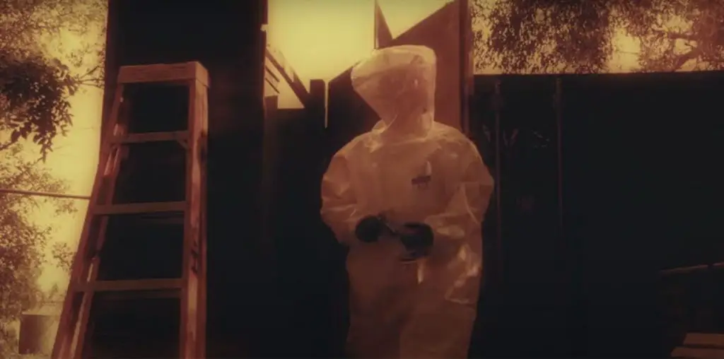
Lots of Tom Cruise and lots of ominous clouds gathering can be found in just about all the trailers and TV spots, of which there are four and 16 respectively. For there being 20 video spots there’s an astounding lack of originality to any of them. They all focus on Cruise and Dakota Fanning as his daughter reacting to some off-screen menace. The occasional one has co-star Tim Robbins looking grimy and like he’s avoiding something terrible. Either it’s aliens or a right-wing politician, I’m not sure.
Anyway, I don’t particularly like these spots. There’s no rhyme or reason to them. Very few of them follow any sort of linear format and instead seem to just jump in during the middle of the invasion. I’m sorry but I need more from a trailer than just that, especially when we’re talking about Spielberg. One of the problems with “Jurassic Park” was that there was very little in it that identified it as a Spielberg film. Based on the trailers I don’t see anything bearing the director’s distinctive mark. That’s too bad since I’ve really enjoyed his recent movies (I even like about 75% of “The Terminal.”)
The Posters
If I thought the trailers were boring then the posters are downright snooze-inducing. There’s either the ones with the alien hand reaching out and grasping the earth or the block letter one. The hand posters have recently been compared to the cover of one of L. Ron Hubbard’s Scientology-themed sci-fi books (I’ll find the picture and link to it off of my blog). The block-letter version has always reminded me of “Monty Python’s Life of Brian.” Not very exciting. I just wish they had been able to find something more innovative.
This is actually the coolest aspect of the campaign. Not so much because it helps sell the movie but because it looks like it was laid out by someone who knew what they were doing.
“About the Film” is perhaps the shortest synopsis I’ve seen of a movie to date. Basically it says the earth is at war, this is an adaptation of a Wells novel and that it is told through the eyes of one American family. That right there is half the length of the synopsis itself. Also, why did they feel the need to specify it was an “American” family in the movie? Was there some fear audiences would mistake Cruise and Fanning for a Pakistani family? The mind reels.
Perhaps the most fully-stocked section of the site is “Media”. There you will find all four domestic – and a Japanese – trailer, 12 TV spots, some clips and a link to the soundtrack. I love it when a studio pays attention to this section and does more than just post one or two trailers there. The website should be all-encompassing and this one is just that.
Moving on we come to “Downloads”. I can’t even list all the features available here. There are wallpapers in every conceivable style and language, posters, a screen saver and a bunch of buddy icons. Pretty cool. “Photos” is just what it sounds like, a collection of almost 40 stills. “Features” includes a Yahoo IMvironment, something I’m still pretty fuzzy on and Moviefone’s “Unscripted” Q&A between the star and director. Finally there is the “Survival Game.” I’m not going to go into the game play but it’s pretty fun if you have some time to spare.
Overall
As much as I want to believe this reteaming of Steven Spielberg and Tom Cruise is an authentic attempt to create some meaningful contribution to the lexicon of film I just get the feeling it’s a grab at some easy money. The campaign is not that exciting and honestly didn’t build my anticipation for the movie all that much. Sure the trailers look kind of cool but computers can do a lot and for as much as they don’t show what is seen is kind of lackluster. The best part of the campaign was the website since it acts as a repository for all the other promotional materials to date. Nice to have a one-stop spot for posters, trailers and such.
As moviemaking costs increase, the pressure to successfully market those movies becomes greater. In an attempt to show how marketers are trying to put the most hinders in the theater seats, Chris Thilk breaks down why some movie campaigns work and some don’t. The posters for “The Rocketeer” and “Unforgiven” remain two of his all-time favorites. For Chris’ ongoing movie journal and other various musings, visit his Movie Marketing Madness blog.

