Alfred Hitchcock movies are still scary. When the birds attack Tippi Hedrin we all start to feel phantom scratches and pecks on our scalps. We empathize with Cary Grant as he tries to convince the people manipulating him that he’s not Kaplan. Even with all the movies that have come since then, they still pack a visceral punch that can’t be fought.
So will the movies of M. Night Shyamalan hold up as well? Will we still be discussing The Sixth Sense twenty years from now? That may depend on two things: 1) How well this film does financially and 2) How well this film does artistically. Shyamalan needs to really make his mark and prove that he can keep producing at an exceptional level from movie to movie.
All three trailers are put together remarkably well. They all move from peaceful and subdued to nerve-racking, pulse pounding and breast-heaving at a pace that builds anticipation well.
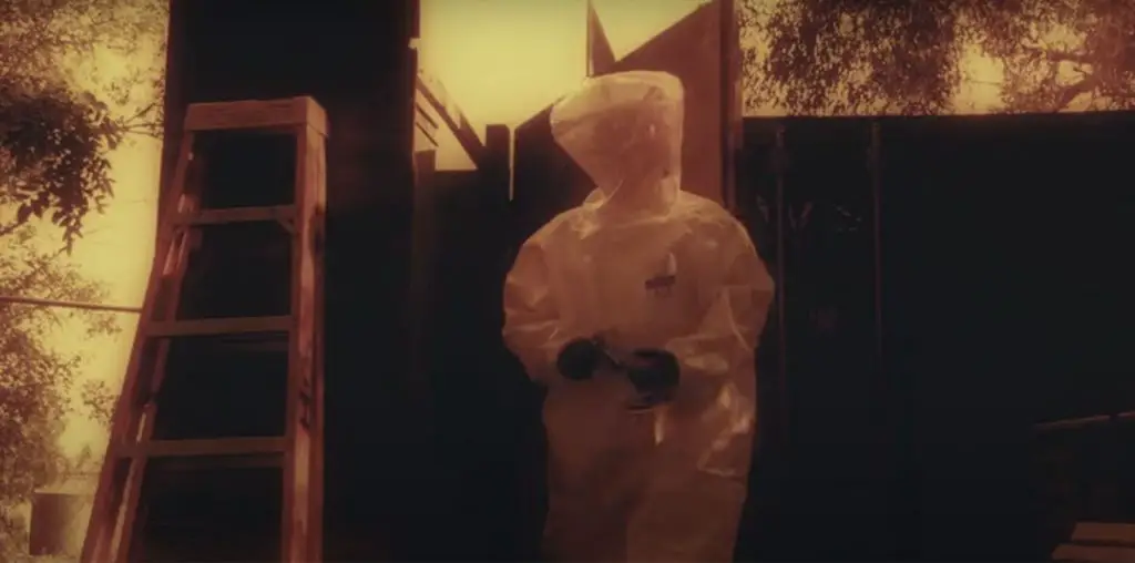
The teaser does exactly what any good teaser should do. We get faint glimpses of the plot, the setting and the characters and that’s about it. There’s almost no allusion to who is going to be the main protagonist of the story. The theatrical version goes only slightly farther. William Hurt (who is now and will be forever atoning for Lost in Space) provides some exposition and there are vague warnings of the creatures, whatever they may be, that live in the woods surrounding the village.
What looks to be a TV spot (it’s labeled on the website as a “60 second trailer”) is the weakest of them all. It carries a completely unnecessary voice-over narration that kills whatever atmosphere the trailer is creating. It’s also the only version to provide an executive summary of the Shyamalan’s career, with brief clips from Sixth Sense, Unbreakable and Signs.
The Poster
“Let the Bad Color Not Be Seeen…”, “Heed the Warning Bells…”, “Never Enter the Woods…”. The three rules of the village have such a nice progression I almost expected there to be a fourth one espousing the virtues of using BurmaShave. Whether the phrases appear on their own individual posters, or all on one, they at the same time elude to the plot while giving almost nothing away. I just have this fear that as cool as the posters are the cover to the eventual DVD will suffer from either Big Floating Head syndrome or Give Away the Entire Plot With One Picture disease. Enjoy these posters because they’re about as cool as the concept gets.
The main pages of the site are very serene. On the main menu page there is a picture of the village. Two birds suddenly start flowing out of the woods in the background. I kept expecting them to do something or thinking that clicking on them would open up some secret portion of the site. Neither guess was accurate. They did nothing which, in keeping with Shyamalan’s overall style, helped build the anticipation.
All the usual pieces are here: Laudatory biography of the director, story recaps, downloads, trailers and production and story notes. There are a few that caught my attention as being unique so let’s focus on those.
“Face Your Fears” is this site’s version of registration. You are actually encouraged to enter your fears for viewing by and discussion with other registered members. The tactics used to get personal information out of people always intrigues me. It reminds of something Kramer said on “Seinfeld”: “Why does Radio Shack need my phone number to sell me some batteries?”.
“Enter the Woods” is a very cool interactive portion of the site that allows you to get in on the action (but not in a Traci Lords kind of way). You can ring the warning bell or open the trapdoor in the watchtower. While this may not sound like much these really capture the feel of the trailers.
Media Coverage
I want to take a brief moment and mention the media coverage in the weeks leading up to the movie’s release. The Sci-Fi channel had been hyping a documentary on MNS, conveniently timed to coincide with the release of “The Village”. About two weeks prior to release stories began to emerge that Shyamalan had ended his participation with the makers of the documentary. Sources said the makers were digging too far into his personal life and exposing secrets M. Night didn’t want out there. There was much speculation as to what these secrets might be and how they may have influenced his work.
It was then revealed that the stories about pulled participation were false. In fact, they had been planted by the marketing team behind the movie as a part of a “viral marketing” effort. There was no controversy, only hype. This was a great play in that there were then two rounds of stories, all of which mentioned not only the Sci-Fi channel program but also the movie itself. Masterstroke in my opinion.
Overall
There’s not a bad play in this campaign. They cut nice trailers (except the narration in the TV spot), they created wonderfully mysterious posters and put together a website that nicely compliments everything else. The inclusion of the planted stories about the Sci-Fi channel documentary accrued at least three or four more news cycles for the movie at a critical time just before the opening.
As moviemaking costs increase, the pressure to successfully market those movies becomes greater. In an attempt to show how marketers are trying to put the most hinders in the theater seats, Chris Thilk breaks down why some movie campaigns work and some don’t. The posters for “The Rocketeer” and “Unforgiven” remain two of his all-time favorites. For Chris’ ongoing movie journal and other various musings, visit his Random Thoughts blog.
