


Get a look at the entire library of 427 movies at the Fineman Films web site ....
Picking the right still image to represent your film is essential to the success of your marketing campaign. With limited opportunities to grab the attention of an audience or a reviewer, your key image really needs to pop–right alongside your awesome poster, killer trailer, and memorable logline.
Smarthouse Creative is a film marketing agency that helps independent filmmakers reach their audience. Our team has varied backgrounds that help inform the advice we provide our clients: Co-Founder Brad Wilke has a background in film festival programming, selecting films for both the Seattle International Film Festival and Portland Film Festival. Co-Founder Ryan Davis has spent many years working in film publicity, and before that was on the exhibition side of things. Director of Marketing Amie Simon is a social media pro and also a die-hard horror fan and Rotten Tomatoes-certified film critic.
We all sat down to discuss what we think makes a great film still using Hereditary as an example.

STILL 1
RYAN: This still just does not do the film justice. It doesn’t capture anything iconic or unique about the movie. The colors are eye-catching, though.
AMIE: Agreed! I mean, I love both Toni Collette & Anne Dowd, but since they’re just sitting at a table, I don’t know what this movie is about.
BRAD: There just isn’t enough context here to make this image work. Promotional stills work best when they engage the viewer’s imagination and invite them to fill in the blanks as to what story this film might ultimately tell.

STILL 2
RYAN: Definitely not a key still, especially when a killer image of Toni Collette is an option! This actor will only be recognizable to people who have seen the movie. It’s also too tightly cropped to be usable in most marketing materials — it doesn’t give you many options for layout.
AMIE: I like the look in his eyes, but yes. This doesn’t give me a sense of place, or what the film is about.
BRAD: This frame could have been pulled from almost any film, regardless of genre. It doesn’t help tell the story of the film or why someone should spend their time (or money) to see it.

STILL 3
RYAN: This still has the potential to be iconic. It’s subtle and creepy, without revealing anything or being too explicit. Plus the orange really pops. The only thing to weigh would be not using a still with a more famous actress, in this case Toni Collette.
AMIE: This is actually the first still I saw from this film and I was very intrigued! Particularly if you try to focus on what she’s holding …
BRAD: There’s a lot going on in this frame, which makes it a strong contender for key still status. What’s she looking at? Is that a treehouse in the background? It generates a lot of questions that can only be answered by seeing the film.

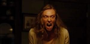
STILL 4
RYAN: This to me has become “the” still from Hereditary, but it does seem a little dark, and also too tightly cropped to be usable in all marketing needs. But it puts the famous actress at the forefront and grabs your attention right away.
AMIE: This is really the BEST, especially for a horror film, which I think is why so many critics used it in their reviews. Toni’s expression is just so, so, so good.
BRAD: This is certainly a powerful still. It conveys genre, suggests danger, and gives the audience a clear sense of what they’re in for if they see the film. This is the kind of still that helps determine your core audience. Half of the people who see this will think “No way. Not seeing that.” The other half will think “Hell yes. Can’t wait to see that.”

STILL 5
RYAN: I love this still. It’s a little dark, so I might brighten it up or add contrast for marketing purposes, but it has the whole cast, says “family” (i.e. hereditary) and has an alluring and creepy vibe. It’s probably too busy for online though — I’d only use this for print. I could see it being used in more general festival marketing though, since it shows a creepy family gathering — could be perfect as the primary still for a shorts program or primary image for a horror festival. That’s something to think about — does my still have broad enough appeal to be used for larger event marketing purposes — it happens!
AMIE: This definitely shows the more dramatic elements of the film, plus gives you a good sense that something isn’t quite what it seems based on each character’s expression. I’ve seen this one used in a quite a few reviews also, and while it doesn’t have that immediate “WOW” pull, it’s still interesting.
BRAD: This is probably my favorite still image. It does a great job of insinuating that “everyone is a suspect,” so to speak. The formal organization of the elements within the frame also suggests that this is not your typical horror film, which might help attract fans of the film’s stars who might not also consider themselves to be horror fans.

STILL 6
RYAN: This is a crazy moment, but this still is giving away too much. It’s an amazing shot, but shouldn’t be used for marketing.
AMIE: A key moment from the film that is a little too spoilery, but this could be good to use for a publication “exclusive” to tease the story.
BRAD: This image should be held in reserve. Let the audience discover it in the theater and then tell their friends about it. I also don’t think it truly represents the tone of the actual film, which could lead to some hard-core horror fans having outsized expectations going into the screening.

STILL 7
RYAN: This could be a great still if it wasn’t so dark.
AMIE: This moment in the film reveals something behind the character, which is why I think it’s so dark – to hide that thing. But yes, it’s so dark I don’t even know what I’m looking at.
BRAD: Agreed, but with a little backlighting and a title treatment in the upper-right quadrant, this could be a solid alternate poster.
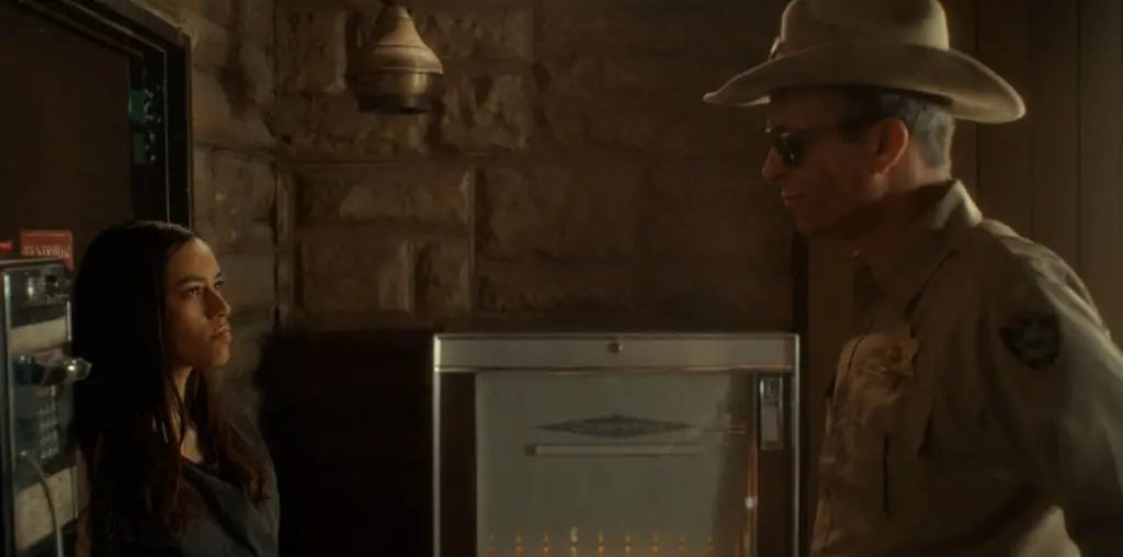
STILL 8
RYAN: This doesn’t uniquely identify the film to me. This could be from any domestic drama. That said, the cropping is good, and your eye moves right to her face. There’s a good tension, you want to know what’s going on here.
AMIE: I think this would be a good secondary still to include (or would have been for Toni’s Oscar campaign!), but it shouldn’t be the main image at the top of the release.
BRAD: Hard to know what’s happening here. This tells me it’s a Toni Collette film, but not much beyond that.
STILL 9
RYAN: This actress has such a unique look, she’s great for the marketing. This shot, however, is too tightly cropped to be usable as a broad marketing item.
AMIE: Yeah – tight crops aren’t good for telling you anything about the film’s story. I need more context to try to piece together what’s happening with this character.
BRAD: Though this image might not check all the marketing boxes on paper, I think it exudes a primal creepiness that sells the film on a visceral level. I definitely remembered this image because it spoke to my gut.
STILL 10
RYAN: Toni Collette is amazing. But this still might actually be too much! I like the coloring and cropping, but somehow it doesn’t give you enough intrigue or tension, it’s almost overkill. What do you guys think?
AMIE: I actually love it! It’s a great plot misdirection, because this still makes it seem like Toni is about to murder someone. Great for horror publications in particular.
BRAD: Yeah, this is a good one. She’s raging about something and I want to know what.
Smarthouse Creative is a marketing agency for independent filmmakers. Whether you’re looking for an overall marketing strategy that marries advertising, social media, and publicity, or just a stand-alone digital ad, social media, or PR plan for your indie film, we can help.
This is a really scared movie.