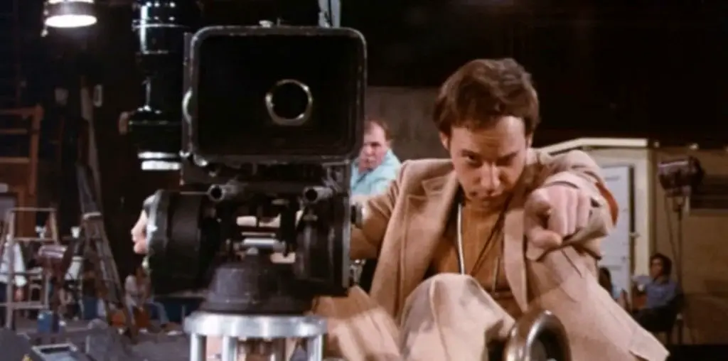
I really enjoy Steven Spielberg’s movies. I’m not a slavish devotee who crosses himself every time Spielberg’s name is mentioned, but the man has done some fantastic work. True, he’s fallen every now and again (I have as many problems with A.I. as anyone else), but even Alfred Hitchcock had some movies that work less well than others.
So there are three major selling points to this movie: Spielberg, Tom Hanks and Catherine Zeta-Jones. The first two are just about money in the bank, despite Hanks’ latest being The Ladykillers, a movie that broke his string of unqualified successes. Still, Hanks’ presence at least provides a hook for the marketers to hang the rest of the campaign on and he’ll need to have quite a few more bombs before that changes.
This is pretty darn effective. We are given pretty constant coverage of Tom Hanks’ face looking bemused, depressed, bewildered and generally shocked at his circumstances while also being told this is the new Steven Spielberg film. Those two points alone guarantee a certain portion of the audience just said, “OK, when does it open and who can I get to babysit?”
I love the use of the clacker-board in the trailer (and this theme will be seen again later) as it is a great way of taking a concept from the movie and integrating it into the marketing campaign.. Granted, the non-digital arrival/departure boards may be a bit antiquated, but it is so effective at getting its message across that I’m not going to nit-pick it. The only problem I have with it is I’ll keep waiting for Tim Robbins to walk past and stare at it until a newspaper blowing by hits him.
The Poster
This is, I feel, the weakest part of the campaign. Hanks is just looking off to the side (presumably at an airport announcement) and that’s it. There was probably a concept design early on in the process that had him sitting in a chair in the airport waiting area. More than likely that was rejected since it would harken back a tad too brazenly to “Forrest Gump”, a movie that desperately needs to be purged from the national psyche.
Interestingly there is no allusion to Catch Me If You Can or that this is a re-teaming of the star and director of that movie. Maybe they didn’t want to get anyone’s hopes (or bile as the case may be) that Leonardo D. was going to be in this one.
This is one of the best movie-related sites I have been to in a long while. The site designers have carried over the use of the clacker-board from the trailer and incorporated them into the site navigation to great effect. There seem to be a lot of sections of the site labeled “Coming Soon” which isn’t encouraging considering the movie opens in less than a week.
“Behind the Scenes” takes you, quite literally, behind a scene. Actually behind the set is more accurate. Clicking here takes you to a picture of the back of the airport set, slowly getting closer until the camera goes through the door and into an unfinished looking set. This slowly morphs to include the lighting and other set design until it appears much like it does in the movie. While that’s all there really is, it’s a view not often seen.
“Virtual Tours” uses the same kind of feel as “Behind the Scenes”, simply applying the walk-around to the whole set. You can select which level of the airport terminal you would like to visit and the camera slowly pans around to give you a view of the entire scene. All in all, very nice.
The “Photo Gallery” is pretty slick and isn’t just a selection of stills from the trailer. There are good shots here of Hanks with the supporting cast and one or two photos of Senor Spielbergo himself. It was at this point I realized Kumar Pallana from Royal Tenenbaums is in this movie, which means I’m going to spend the next few days going around saying, “He’s got the cancer”. Great movie.
Anyway, “The Story” contains the standard cast and crew quotes along with a look at the genesis of the project. “Facts” duplicates some of that but is overall pretty nice and “Multimedia” contains the trailer and TV spot, which I did not like. “Cast and Filmmakers” is interesting since there are more crew names than cast. That’s probably not hard to do, but it shows a commitment to the actual making of the film that these people are being acknowledged.
“Store Promotions” is an interesting, if heavy handed, way of extending the dollars some companies paid for product placement in the movie. You can use the same kind of camera panning used for the “Virtual Tour” to select certain shops where, if you click on them, you’re told about special offers. The crass commercialism of airports makes this feature a perfect fit.
Overall
There is a very nice consistency to this campaign, especially in the use of the clacker-boards. The main selling point is Tom Hanks, which, as I stated above, isn’t that surprising. I would have probably played Spielberg up more, but he’s barely in any of the standard promotional materials. The website almost seems like a DVD bonus feature in its very polished presentation of behind the scenes and production material, a concept which works in its favor. If there’s a weak link in this chain it’s the poster, which conveys almost nothing about anything.
As moviemaking costs increase, the pressure to successfully market those movies becomes greater. In an attempt to show how marketers are trying to put the most hinders in the theater seats, Chris Thilk breaks down why some movie campaigns work and some don’t. The posters for “The Rocketeer” and “Unforgiven” remain two of his all-time favorites. For Chris’ ongoing movie journal and other various musings, visit his Random Thoughts blog.
