Ahh, the black comedy. Such an easy genre to describe (“It’s funny in a tragic way.”), but such a hard one to actually make a good film in. It’s said that drama is easy, it’s comedy that’s hard. If that’s the case then black comedies are the toughest of the lot since they don’t play for outright laughs but instead try to assign the characters some pathos. It’s the kind of funny that you almost have to watch with your hands over your eyes.
That’s what “Pretty Persuasion” appears to be, or at least is being marketed as. A small-town private school girl wants to be an actress and decides the best way to break into the business is to sue her teacher for sexual harassment. That gets her on the news and a big televised stage to show off her talents. Ron Livingston stars as the teacher and Evan Rachel Wood is the tease…I mean student. Let’s dive in.
The Poster
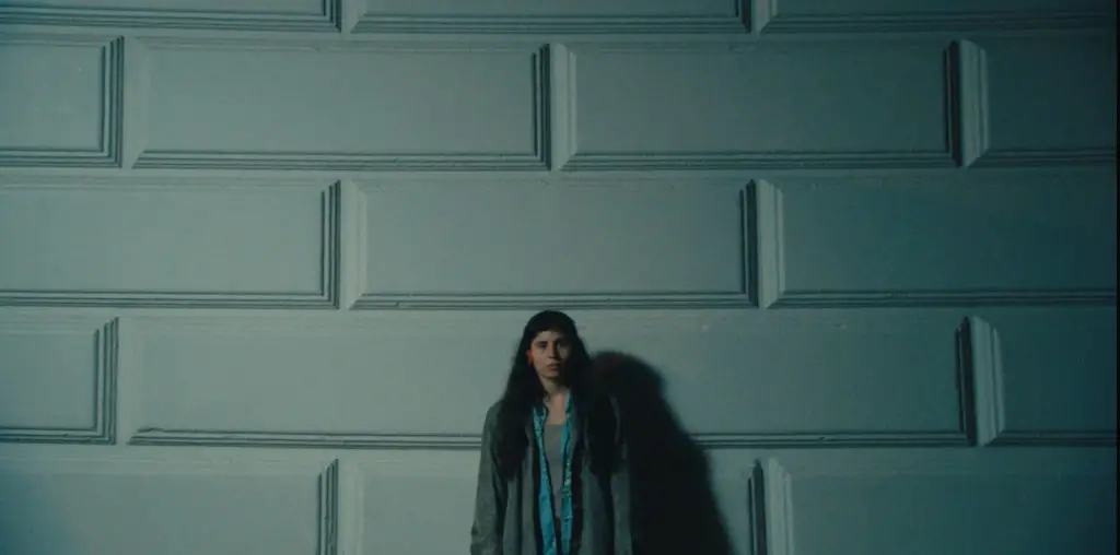
Very cool with starkly lit black and white photography. I love this poster. It’s a great example of how to convey the attitude of a movie in a simple visual. The only problem is that it makes me wish the movie were shot in black and white, kind of like Tim Burton’s “Ed Wood.” I think the non-color photography would work better at conveying the surreal aspects of the story, but that’s an artistic choice they didn’t consult me on.
As you’d expect from a story-driven comedy this one is full of dialogue, with most of the best lines going to James Woods, who plays the clueless father of Evan Rachel Wood. It’s got a ton of great lines (Selma Blair saying “I’m a little schoolgirl” and spanking herself skyrocketed into my top five favorite film moments) and the appearance of Michael Hitchcock (Best in Show, “Waiting for Guffman”) increases the comedic potential of the movie.
It’s clear from the trailer that many of the laughs are going to come at the expense of what could be called political correctness. Many of the jokes are racist, sexist or otherwise completely inappropriate. For that I have a whole new level of respect for the filmmakers. Bring it on. Break the boundaries so many have set. If there’s one thing the piss-poor performance of this year’s “blockbusters” should be teaching us it’s that playing it safe doesn’t pay off either artistically or financially.
I’ve long bemoaned the lack of originality shown by major studios when it comes to their websites. It’s not so much the content, even that needs to be overhauled, it’s the packaging. Because I expect so little I was pleasantly surprised by the site for “Pretty Persuasion.”
The entire thing is laid out like a board game, with cards you can turn over, a wheel to spin and a path to follow. A lot of the content is duplicated from one area to the other but for a change it was actually fun to poke around the site and find stuff.
“Show Off” is the label for Downloads, which at this point just includes some wallpaper. But still, that’s wallpaper featuring Evan Rachel Wood so, you know, that’s just fine. “Gallery” features about nine stills from the flick, most of which are lifted from the same footage that appears in the trailer. “Audio” contains some audio files from the flick and is an alright feature if you just want to listen to some dialogue. Seems kind of pointless, though.
There’s a cool extended clip (presumably from the movie) showing Jane Krakowski as the TV news reporter delivering a report from the school that serves as the movie’s setting. It’s labeled “On Your Way To Hollywood” if you’re interested. If you’re a website runner or other movie journalist without high-level access to studio executives the “Press” section is very cool. In there you can find an electronic press kit, some hi-resolution photos and a downloadable version of the poster. I wish more studios would do this.
Scattered throughout the site are cast and character biographies, most of which are presented in a form that seems to be part yearbook photo, part mugshot and part personal ad. They’re kind of funny if not extraordinarily informative.
What struck me as interesting is that the amount of time I spent on the site was completely out of proportion with how much actual content is on there. I was just having fun playing the game and just futzing around on the site. That should tell the studios something as far has how they layout these things.
Overall
I really like this campaign. The movie itself looks funny and the trailer conveys that very well. The poster maybe looks a little too serious for a comedy, even a black comedy, but that’s open for debate. If nothing else an interesting website makes this a movie I recommend. I’d love to see this get wider play in TV ads and such since it seems like it would be effective counter-programming to the big, dumb studio flicks that have been opening recently and dying rather quickly.
As moviemaking costs increase, the pressure to successfully market those movies becomes greater. In an attempt to show how marketers are trying to put the most hinders in the theater seats, Chris Thilk breaks down why some movie campaigns work and some don’t. The posters for “The Rocketeer” and “Unforgiven” remain two of his all-time favorites. For Chris’ ongoing movie journal and other various musings, visit his Movie Marketing Madness blog.

